Sadly, Dr. Fletcher passed away in 2008.
H/T to Andrew Williams @andrw100 on Twitter for the link to this presentation
Global Climate Change
Dr Joseph Fletcher lecture
in the Legacy Maestro Series
California State University, Monterey Bay CSUMB
July 2000
| This is a transcript from the video of Dr. Fletcher's presentation, enhanced by high quality images because the the video suffered from noise and unsharpness. Also some missing images were added. Dr Fletcher was with NOAA OAR Deputy Assistant Administrator for Labs and Cooperative Institutes. Joe retired in 1993 and moved to Sequim WA where he passed away on July 6, 2008. Obituary, mirrored below, as well as Fletcher-related links and video of the lecture |
 Twelve years ago at the New Hampshire Primaries, five potential presidential candidates sat down and talked about the problems of the coming century. All five of them agreed that among those problems perhaps one of the most important would be dealing with the problem of dealing with global climate change. Global climate change is the topic of this seminar, and we are increasingly being told in the media of various kinds, that the habitability of Planet Earth is in our hands. And the increasingly strident voices keep saying "we must act now and do very drastic and expensive things in order to meet this challenge". So I should try to outline some of the things that happened in the last twelve years that increase our understanding of the problem, and roughly where this understanding stands today, and at the end even look into future of the next century and speculate how the climate may evolve over the next half century and the century. Twelve years ago at the New Hampshire Primaries, five potential presidential candidates sat down and talked about the problems of the coming century. All five of them agreed that among those problems perhaps one of the most important would be dealing with the problem of dealing with global climate change. Global climate change is the topic of this seminar, and we are increasingly being told in the media of various kinds, that the habitability of Planet Earth is in our hands. And the increasingly strident voices keep saying "we must act now and do very drastic and expensive things in order to meet this challenge". So I should try to outline some of the things that happened in the last twelve years that increase our understanding of the problem, and roughly where this understanding stands today, and at the end even look into future of the next century and speculate how the climate may evolve over the next half century and the century. |
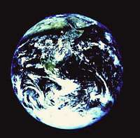 This is planet Earth. It is the blue planet because most of it is covered with water, about three-fourths. You can see the Horn of Africa on the top. This particular picture was taken with a handheld camera by one of the Apollo astronauts, returning from the moon. This is planet Earth. It is the blue planet because most of it is covered with water, about three-fourths. You can see the Horn of Africa on the top. This particular picture was taken with a handheld camera by one of the Apollo astronauts, returning from the moon.
I will divide my remarks into three sections:
- First I would like to remind you of a few geographic features of the planet we live on, that are important in considering the problem of climate.
- Second the processes that are involved and the kind of change that we observe to be happening.
- And thirdly, what forces those changes. Is it all greenhouse enhancement? Is it some external factor like solar irradiance? And that will be the bottom line of the presentation.
|
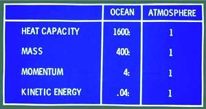 In terms of the properties of the ocean and the atmosphere which are the two working fluids in this giant dynamic machine, which redistributes the heat from the sun over the planet, so that the outgoing radiation balances the outgoing radiation, the physical properties of these two working fluids are very different, and are here compared. For example, the ocean has 1600 times the heat capacity of the atmosphere; 400 times the mass; 4 times the momentum; and only one-twentyfifth the kinetic energy. In terms of the properties of the ocean and the atmosphere which are the two working fluids in this giant dynamic machine, which redistributes the heat from the sun over the planet, so that the outgoing radiation balances the outgoing radiation, the physical properties of these two working fluids are very different, and are here compared. For example, the ocean has 1600 times the heat capacity of the atmosphere; 400 times the mass; 4 times the momentum; and only one-twentyfifth the kinetic energy. |
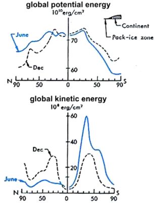 The second thing I want to point out, is the huge difference between the northern hemisphere (NH) and the southern hemisphere (SH). The southern hemisphere is very much more energetic than the northern hemisphere, and in this graph the two hemispheres are compared. In the bottom graph we see the blue line depicts the distribution by latitude of kinetic energy. And in the southern hemisphere winter, when the contrast is greatest, the northern hemisphere summer, the kinetic energy is roughly five times greater than the northern hemisphere. In the opposite seasons, the two are more comparable because that is the maximum for the NH and the minimum for the SH. For the year as a whole it is somewhere between 2 and 3. The second thing I want to point out, is the huge difference between the northern hemisphere (NH) and the southern hemisphere (SH). The southern hemisphere is very much more energetic than the northern hemisphere, and in this graph the two hemispheres are compared. In the bottom graph we see the blue line depicts the distribution by latitude of kinetic energy. And in the southern hemisphere winter, when the contrast is greatest, the northern hemisphere summer, the kinetic energy is roughly five times greater than the northern hemisphere. In the opposite seasons, the two are more comparable because that is the maximum for the NH and the minimum for the SH. For the year as a whole it is somewhere between 2 and 3.
|
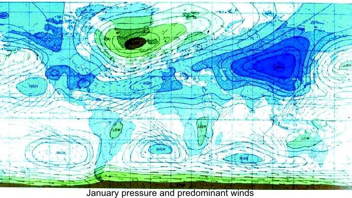
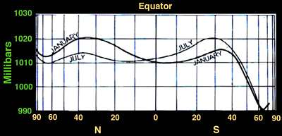
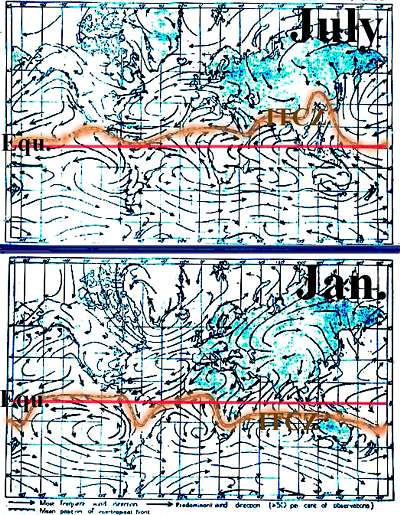 This leads to the distribution of winds over the planet, and in the opposite seasons for July and January, this is the picture of the surface winds and in lighter colors are the pressure fields that drive the wind system. I would point out here that in the left of the picture the difference between summer and winter is not so great [around the orange colour]. The intertropical conversion zone which is roughly the boundary between the circulation that is dominated by the SH than the NH, stays pretty close to the equator. But in the Asian sector, which is on the right on the screen, the annual migration is enormous. In July for example, the convergence is way up in Mongolia, several hundred miles north of Beijing, whereas in January, it is 20 degrees south of the equator, in the East of Australia here. That is an annual difference of about 60 degrees, an enormous change that happens annually and among its consequences are a regular cycle of annual change, knowledge of winds when the rainfall will occur, and this is why half the population of Earth lives in this zone. China is almost 1/4th of the population, India is almost as big and the rest of South-East Asia thrown in, makes it well over half of the planetary population. So in general it's very favorable to economic and societal conditions to have a climate with certain characteristics which are favorable for agriculture and meeting the needs of society. This leads to the distribution of winds over the planet, and in the opposite seasons for July and January, this is the picture of the surface winds and in lighter colors are the pressure fields that drive the wind system. I would point out here that in the left of the picture the difference between summer and winter is not so great [around the orange colour]. The intertropical conversion zone which is roughly the boundary between the circulation that is dominated by the SH than the NH, stays pretty close to the equator. But in the Asian sector, which is on the right on the screen, the annual migration is enormous. In July for example, the convergence is way up in Mongolia, several hundred miles north of Beijing, whereas in January, it is 20 degrees south of the equator, in the East of Australia here. That is an annual difference of about 60 degrees, an enormous change that happens annually and among its consequences are a regular cycle of annual change, knowledge of winds when the rainfall will occur, and this is why half the population of Earth lives in this zone. China is almost 1/4th of the population, India is almost as big and the rest of South-East Asia thrown in, makes it well over half of the planetary population. So in general it's very favorable to economic and societal conditions to have a climate with certain characteristics which are favorable for agriculture and meeting the needs of society.
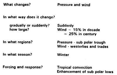
So we might ask: "How does climate change?". What change, what parameter for example is of greatest interest? And of course we look at the things we have data on, and have a long record of, and the first things to look at are pressure and wind. |
 We have a long record because a far-sighted individual, Matthew Fontaine Maury (1806-1873) who at that time headed the hydrographic office and built the sailing charts to help mariners sail at various places around the world. He realized the value of accumulating a dataset which would really document the behaviour in all the oceans. So in 1854 all the participating countries agreed on when to take observations, how to take them, how to archive them and so on. And this has been going on now for almost 150 years up to the present, resulting in several million, like ten million observations. And that provides us with a rather good documentation of just what has been happening at the ocean's surface in all parts of the global oceans. We have a long record because a far-sighted individual, Matthew Fontaine Maury (1806-1873) who at that time headed the hydrographic office and built the sailing charts to help mariners sail at various places around the world. He realized the value of accumulating a dataset which would really document the behaviour in all the oceans. So in 1854 all the participating countries agreed on when to take observations, how to take them, how to archive them and so on. And this has been going on now for almost 150 years up to the present, resulting in several million, like ten million observations. And that provides us with a rather good documentation of just what has been happening at the ocean's surface in all parts of the global oceans. |
 So we can refer to this observational record to ask such questions: So we can refer to this observational record to ask such questions:
- What is changing? Mainly pressure and wind.
- In what ways do they change? Do they change gradually or suddenly? Where does it happen? How large are the changes? And tell you the answers to some of these questions. We will see that the wind's history changes on the order of 15% in a decade and 25% in a century.
- In what regions? Are there particular regions that occur first? And we will see, especially in the wind record, the answer to that.
- In what season? The answer is in winter in both hemispheres, the strongest signals occur as you might expect when the forcing is greatest in the planetary factors.
- What are the most important factors in forcing and the response to these changes? We will come to the role of tropical convections in modulating the variability on the century time scale in discussing this.
|
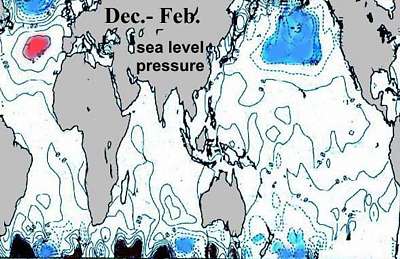
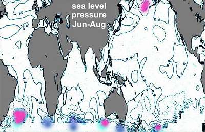
First of all let's look at the distribution of atmospheric pressure. The blue are the high pressure areas and as you will see the NH with two continents, the Eurasian continent and the American continent, two oceans, the Atlantic and the Pacific, favors wave number two. And the distribution is as shown here in colour with the strongest location covering eastern Eurasia. In the SH we have three oceans, and almost three continents if you count Australia and the islands as a third continent. And as you might expect, we see the average picture is three high pressure cells in the eastern part of each of the three oceans. The dramatic difference is that in the SH, especially in the higher latitudes, you have no orographic barriers like mountain ranges, except the Andes. The rest of it flows freely over an ocean.
The Andes are quite high and constitute an enormous orographic barrier and they extend right down into Antarctica in the form of the highest mountain ridge in west Antarctica as well. And this influences atmospheric circulation. One of the things that we will touch upon, is that for example, whenever the natural behaviour to following the laws of physics, makes the system want to shift to a longer wavelength, that is instead of wave number 3, say to wave number 4. The Andes acts as an anchor as you'll always tend to have an upwind high. You'll always end up with a lee trough and a high in the eastern South Atlantic, so the adjustment to a higher wave number occurs in the huge Pacific area between the Andes and around the globe. So this has a very high leverage on both hemispheres, in the sense that it changes rather substantially the inflow of converging air into the equatorial region which generates deep convection and influences the forcing factor that exerts a large influence on both hemispheres simultaneously.
 We'll take briefly a look at some of these fields. When the pressure field changes, for example, how does it change? This slide shows us the answer to that. You might describe it as saying, over a couple of decades in the last half century, the nature of the change is simply an enhancement of the mean condition: highs a little higher; lows a little lower. We'll take briefly a look at some of these fields. When the pressure field changes, for example, how does it change? This slide shows us the answer to that. You might describe it as saying, over a couple of decades in the last half century, the nature of the change is simply an enhancement of the mean condition: highs a little higher; lows a little lower. |
 If you look on the decadal time scale at the wind field directions, this shows us their evidence. The subtropical highs for example, here in the Atlantic is shown in red, are higher by about 3 millibars for a couple of decades, the Icelandic low is lower by 2-3 milli bars. In the Pacific the contrast is not quite as great but it is comparable. The Aleutian low is about 3 mbars lower, and although it is not colored, the subtropical high is also a little higher. If you look on the decadal time scale at the wind field directions, this shows us their evidence. The subtropical highs for example, here in the Atlantic is shown in red, are higher by about 3 millibars for a couple of decades, the Icelandic low is lower by 2-3 milli bars. In the Pacific the contrast is not quite as great but it is comparable. The Aleutian low is about 3 mbars lower, and although it is not colored, the subtropical high is also a little higher. |
 In the opposite season, the summer, the changes are very small, much smaller than in winter. In the opposite season, the summer, the changes are very small, much smaller than in winter. |
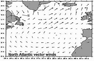 If we look at the vector wind field, taking one decade and subtracting another decade, a couple of decades earlier, this is the North Atlantic, and we see that the change is coherent with the mean condition and expresses an amplitude which compares well with the change in pressure and so on and we will return to this later but this shows a very strong change in the North Atlantic in connection with climate change on the planet. If we look at the vector wind field, taking one decade and subtracting another decade, a couple of decades earlier, this is the North Atlantic, and we see that the change is coherent with the mean condition and expresses an amplitude which compares well with the change in pressure and so on and we will return to this later but this shows a very strong change in the North Atlantic in connection with climate change on the planet.
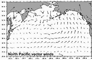
This is the North Pacific showing the same vector wind field and it is also very coherent. So we are seeing that all the variables that play an important role, behave coherently with each other in ways that the controlling physics say they should. |
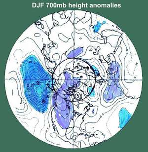
 An overview of some planetary features, point out the enormous difference between the two hemispheres, mainly caused by the presence of the Antarctic. This shows the pressure averaged around circles of latitude from the North Pole to the south. It shows that the gradient between the mid-latitudes and the SH towards Antarctica, is simply enormous. We will explore this in a little bit more detail on later slides. An overview of some planetary features, point out the enormous difference between the two hemispheres, mainly caused by the presence of the Antarctic. This shows the pressure averaged around circles of latitude from the North Pole to the south. It shows that the gradient between the mid-latitudes and the SH towards Antarctica, is simply enormous. We will explore this in a little bit more detail on later slides.
|
Looking at sea surface temperature (SST) which you hear often quoted these days in talking about global warming. This is the mean temperature of SST. Cold in the polar regions in both hemispheres. The gradients are very strong in the north-west Atlantic and in the north-west Pacific and south of Africa, and if we keep in mind the change in the energetics of the wind system between the seasons, we can easily see that with the migration between north and south, the displacement of the wind system, the ocean reflects the same rhythm. |
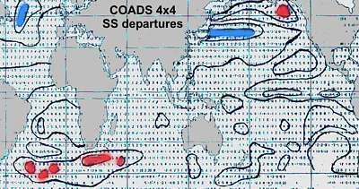
The changes that span over a decade are greatest in those regions of high gradients in the northwest Atlantic, the northwest Pacific, northeast Pacific and south of Africa. This is a picture of what the data says to us and it is what you would expect. A couple of slides later you'll see that this general distribution strongly influences the quoted global changes. |
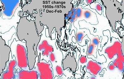 If you look at a couple of decades apart during last century, the warming of the ocean which is often quoted as planetary warming, is dominated completely by the ocean between the equator and 30 degrees south, and in fact the NH mostly shows cooling instead of warming. So we are reminded that this demonstrates above all, the dominating influence of the wind system above the ocean. If you look at a couple of decades apart during last century, the warming of the ocean which is often quoted as planetary warming, is dominated completely by the ocean between the equator and 30 degrees south, and in fact the NH mostly shows cooling instead of warming. So we are reminded that this demonstrates above all, the dominating influence of the wind system above the ocean. |
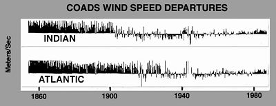
Now we will turn our attention to the changes in the wind, and this is a startling surprise if you haven't seen it before, because we see an enormous change over the last 150 years of the surface wind. These have been rather well observed, because remember, starting in 1854, all the ocean commerce was in sailing ships and up to 1900 anyway, there were more observations coming from along the sailing routes in the high latitudes of the Indian Ocean and the south Atlantic, than you see today. So they are rather well observed, well reported, and we have a good record to turn to.
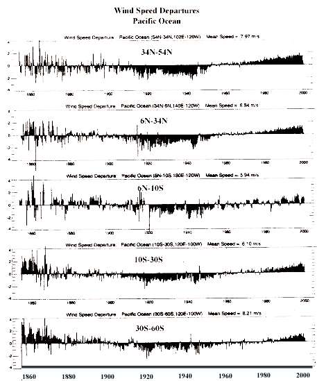
There are several things about this record that we can take note of and perhaps be a little startled by: One is the range of variability. The scale on the left shows 4m/s at the highest peak and a good part of the time 2m/s greater than the mean wind speed. The mean wind speed for the planet all over the world's oceans is about 6.5 m/s, so 2 m/s is almost one third of the mean value. That's seen an enormous change, and if you're talking about evaporation which is directly proportional to the wind speed, so that means a similar change in the amount of evaporation since the heat of evaporation is 640 calories per gram, is drawn from the ocean and exerts a cooling effect. This heat is returned to the atmosphere at whatever time and place condensation of that moisture takes place. That represents an enormous transfer of energy between the ocean and the atmosphere, which is not normally taken into account in talking about global energy exchanges and is a very large value compared to for example a doubling of CO2, which is taken to be 3.5 Watt per square meter. Compare that to 50 W/m2 reflected in the wind field change over the century here. |
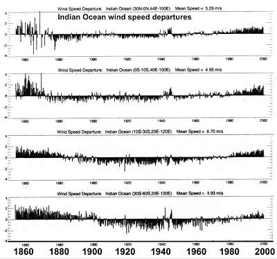
A second thing that may strike us is that the general pattern is coherent over the whole planet. We see very high in the early part of the record, increasing toward more recent decades; a minimum around 1920 or so in the Dust bowl Years, and an increasing trend since about 1940, which is still increasing today. This is the record of the change by latitude band from north to south, in this case for the Indian Ocean. The second thing that we can note, is that change can occur very suddenly. Look for example around the mid-1870s at the sharp decrease in the second from the top graph shown here. In the bottom graph and we see an even sharper decrease which occurred only in a year or two, and this is the SH westerlies which are the most vigorous wind system on the planet by far. So this might be expected to be reflecting changes that would occur throughout the planet. And indeed that change co-incides with a decrease in the discharge of the Nile river by about one-third. Since Egypt depends entirely upon the Nile, that is a dramatic impact on the society there. Monsoon rainfall in India decreased by almost one-third. Monsoon rainfall in China increased by about 25%. |
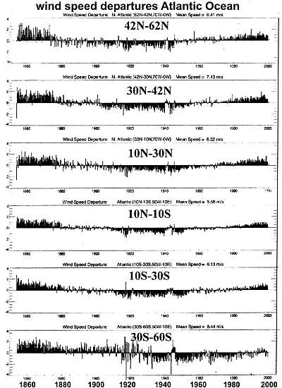
And this is the record from the Atlantic from north to south and again I remind you we see the same sort of signals occurring in the time record, but also to remind you of the coherence in the global system. Whatever is forcing this kind of change, it is effectively reflected in the wind field everywhere. If you look at the percentage change between the Atlantic and the Indian Ocean, they are about the same. |
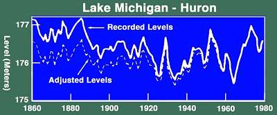
Since evaporation depends mainly on the speed of the surface wind, you might expect that rainfall (what goes up comes down), will reflect the same large-scale variability. This is what we are seeing here. We do have long records of the level of the Great Lakes.
That shows that during a period of high speeds of the winds in the early part of the record, while increasing towards the later part of the record, the level of the great Lakes is reflecting the same sort of change, and in-between in the 1930s and 40s which is the minimum. This is in great contrast to some of the discussions of global change who emphasize that in a warmer greenhouse world we will have desiccation and dryness throughout the mid-continent. But this follows a very logical pattern, as the wind fields increase in intensity, more moisture is carried over the continent and into the continent where it falls out as rainfall and the rain gauge of the Great Lakes tells us the same thing. |
Now to return to those sharp changes occurring in the Indian Ocean and the Atlantic, one thing to take note of to be understood, is that they are strongest in particular regions. For example, in the Indian Ocean, the change that was pointed out, is reflected in the speed of the SH westerlies which is between 40 and 50 degrees south, which is the strongest wind field on the planet. In the Atlantic, the change occurred first and most strongly in the North Atlantic but is reflected throughout the rest of the planet, but not all at the same time.
|
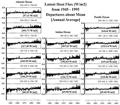
The ocean's latent heat flux (1945-1995) encourages us to keep in mind that evaporation and rainfall go together. For the last 50 years or so, we have a pretty good record in this dataset of evaporation which takes into account not only the wind speed but also the sea surface temperature and the lapse rate, and is archived independently and can be accessed easily. So you see the same pattern which is reflecting in this case not the whole period from 1854 but the more recent half and especially the warming in the last 25 years.
|
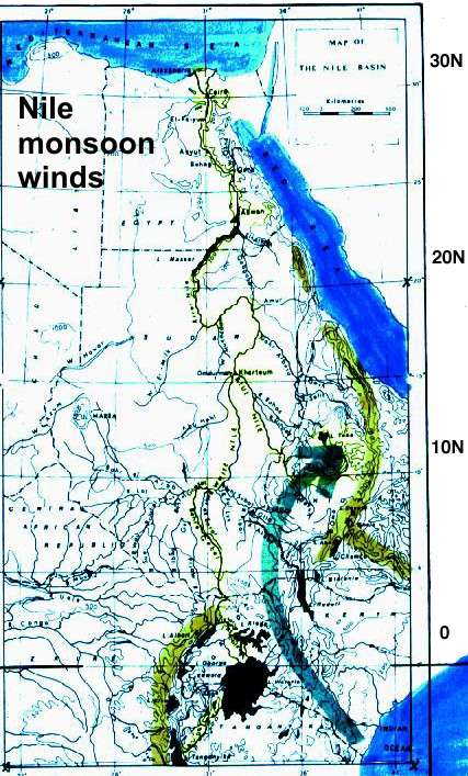
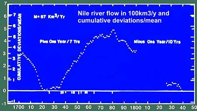
We have a very long record of the discharge of the Nile. The first thing the Arabs did when they conquered Egypt, was to build an observatory - believe it or not - in 622 AD. Ever since then the observatory has been in operation - a little man comes trotting out, opens the side doors and reads the dipstick which is connected by an underground tunnel to the Nile river, so it reflects the level of the Nile. The record since 622 is the longest record that has clear and unequivocal inferences for climate change that we know of. We'll take a brief look at that and what it is trying to tell us. Fortunately we have over the Indian Ocean a good record of the winds since 1854 and this is closely related to the rainfall in the catchment basin for the Nile. The White Nile which is about one-third the flow at Cairo, has its headwaters at Lake Victoria and surrounding lakes, at the very bottom of this slide, but that is only one-third of the total flow.
Two-thirds of the total flow comes from the Blue Nile and its headwaters are near the arrow head shown here at a small spot, Laka Tana in northern Ethiopia. Not only does that account for two-thirds of the total flow of the Nile, but almost all of it flows within the space of 3 months, July August and September. |
This picture is a NASA photograph to show the annual change - summer and winter- of the vegetation pattern for Africa. You can easily see that this is very substantial indeed.
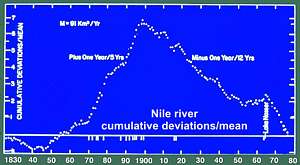 If we look at the longer term in the record of the Nile, and look at 1900, we see a sharp change between a high flow and a much slower flow. The slopes of the two lines are not quite the same. This curve is constructed of cumulative residuals, in other words, the deviation from average each year is added or subtracted so that the inflection point at the top represents that change around 1900, from high flow to low flow. When we see such a sharp change, we have to ask, has this change occurred before, and if so when, and does it reflect some kind of regularity, and what can we learn from this? If we look at the longer term in the record of the Nile, and look at 1900, we see a sharp change between a high flow and a much slower flow. The slopes of the two lines are not quite the same. This curve is constructed of cumulative residuals, in other words, the deviation from average each year is added or subtracted so that the inflection point at the top represents that change around 1900, from high flow to low flow. When we see such a sharp change, we have to ask, has this change occurred before, and if so when, and does it reflect some kind of regularity, and what can we learn from this? |
So we look further back and indeed we see the same regularity. In fact it represents three states of flow: a high flow, a low flow and an intermediate flow as indicated here on the left side. |
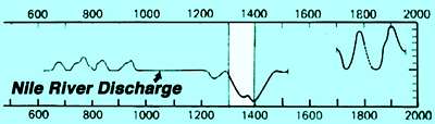
In the record of almost 2000 years back to 622, we see it switching back and forth among these three conditions. We recognize a number of things that we would like to understand. For example, during the entire time it has been in one of these three conditions. During certain periods there is a regular pattern of change. We see a period of 300 years (1000-1300) in which the intermediate flow lasted. This was the period during which the Scandinavians sailed the North Atlantic, settled in Iceland and Greenland, and it was a period of relative prosperity and good economic conditions in Europe. This came to a jolting end, especially in the beginning of the 14th century. |
Barbara Tuchman has written a very interesting book called "A distant mirror" talking about the transformation of society in Europe. The population in Europe in the first half of the 14th century decreased by more than one-third, and agriculture all but disappeared in Scandinavia. The style of architecture suddenly reflected a lot of fireplaces, and the photographs you see, typical of London, came about that period. In recent centuries we see a more regular fluctuation as shown on the right. You see also a gap. That was not because the data was not taken but because the records were taken off by the Turks for safe-keeping in Constantinopel. And there is another 20 year period in the latter part of the record, where Napoleon carried them off to France for safe-keeping. But aside from that, the record is in-tact and is kept in various places in the US and around the world.
Barbara Tuchman (1978): A Distant Mirror: The Calamitous Fourteenth Century, a comparison and contrast between 14th century and late-20th century Europe, with nobleman Enguerrand VII de Coucy as the central figure.
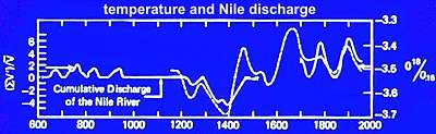 Because of these gaps we would like to be reassured that indeed we are looking at a global signal, so here I have super-imposed the oxygen-18 record, which is an index of temperature, from a stalactite cave in New Zealand, half a world away. As you can se, the phasing shows that indeed this has been a global signal. Because of these gaps we would like to be reassured that indeed we are looking at a global signal, so here I have super-imposed the oxygen-18 record, which is an index of temperature, from a stalactite cave in New Zealand, half a world away. As you can se, the phasing shows that indeed this has been a global signal. |
To pause briefly for some bottom lines or conclusions.
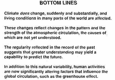
We see that indeed, climate does change; that at times it's sudden and that it is substantial and thus affects living conditions in many parts of the world.
These changes do reflect changes in the pattern and the strength of the atmospheric circulation which seems to be the dominant factor, the most robust feature of climate change. The cause of it is not yet understood. This was formulated ten years ago but I think we understand better today and I will try to stress that in the remaining part of the talk. |
The regularity reflected in the records in the past suggests that greater understanding may yield a capability to predict and this would have great utility for the welfare of society. In addition to this natural variability we have to take into consideration human activities that would significantly alter the global system and foremost among these in the public discussion nowadays is enhanced greenhouse warming. We are hearing a great deal about this. I may lead through the remaining part of this seminar to say that one of our aims is to put these forcing factors into perspective. How much of the warming has been and will be because of enhanced greenhouse and how much could be attributed to other forcing factors?
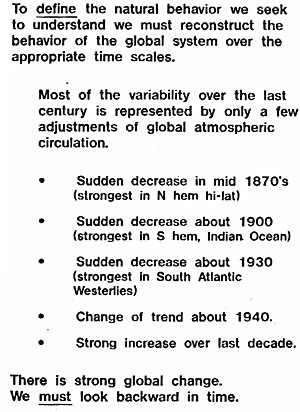 Now to wax a bit philosophical I would point out that to define a natural behavior we seek to understand, we must reconstruct the behavior of the global system over the appropriate time scale. Well, we can do this in great detail for the last century and half, and a strong increase over a recent decade, but that trend really began about 1870. Now to wax a bit philosophical I would point out that to define a natural behavior we seek to understand, we must reconstruct the behavior of the global system over the appropriate time scale. Well, we can do this in great detail for the last century and half, and a strong increase over a recent decade, but that trend really began about 1870.
So there is strong global change and those are the highlights of the kind of change we have seen and found documented in detail. To elaborate on this further, we must look backward in time.

To 'manage' global climate which is being proposed nowadays, a public topic over the last couple of decades, first among government leaders by the Prime Minister of Norway, Gro Brundtland who chaired a United Nations Panel looking at the whole problem. Then by Prime Minister Margareth Thatcher who was very influential in generating concern and attention throughout the European nations, more recently by Al Gore who includes this in many of his speeches which you are hearing these days as well.
But to manage global climate, we must be able to predict how the global machine would evolve without human intervention and then predict how that evolution would be modified by specified interventions. Enhanced greenhouse warming which I would classify as inadvertent, as it isn't something we really want to do. But inadvertent or deliberate, we have to take these two things separately into consideration. |
Gro Harlem Brundtland (born Gro Harlem, 20 April 1939) is a Norwegian Social democratic politician, diplomat, and physician, and an international leader in sustainable development and public health. She served three terms as Prime Minister of Norway (1981, 1986-89, 1990-96), and has served as the Director General of the World Health Organization. She now serves as a Special Envoy on Climate Change for the United Nations Secretary-General Ban Ki-moon.
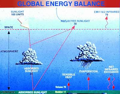
This part addresses what are the processes associated with these changes we observe in the wind field and to do this we'll start with the forcing by the sun. After all, the sun runs the whole system and is represented in this slide by 100 units coming in, 30 units being reflected, and 70 units being balanced by outgoing infra-red radiation reradiated over the planet. The atmosphere and the ocean do the job of redistributing the pattern of incoming with the pattern of outgoing in the way we that have discussed.
|
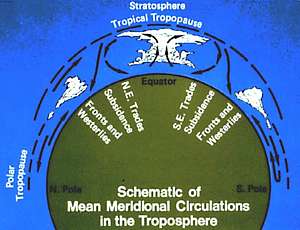
The normal processes on the planet in which deep-convective activity in the tropical region occurs, depicted here, going to 60-70,000 feet and some of that sinks in the lower latitudes, which you see by the arrows, representing the trade winds and this is basically the process which forces the trade winds. In the mid-latitudes on both hemispheres, the trade winds blowing from east to west, we have Darwinate west to east winds which are forced by the equator also, but also by the contrast with their heat sinks represented in Antarctica and over the Arctic. |
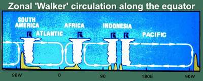
Looking at this picture along the equator we see that this isn't done evenly at all longitudes - in fact I call attention to the Andes, the brown object on the right-hand end - but in three regions particularly, the western Pacific, roughly New Guinea, the Philippines, Malaysia, which is the strongest center. Over Africa, the Congo basin and that is anchored to the mountain range on the eastern side of Africa. Over the Atlantic it is the Amazon system which has the barrier of the Andes on the west, and that is the second strongest. But by far the strongest of these three centers is the one that is over the ocean and is more variable. You don't see much movement in the Andes or in the African topography either. So the strongest centre is rather variable as we shall see. |
There the forcing factor is what I call deep-tropical convection. I say deep because the kind of thunderstorms that we are used to around here, may go to 50,000 feet but in the tropics they can be considerably deeper to 60 or 70,000 feet. This is basically an overturning of the atmosphere. What goes up has to come down and the subsidence is a factor in driving the trade winds and the mid-ocean highs, which are the semi-permanent centers of action of our global climate system.
This is a photograph of this region, taken from satellite during the TOGACOARE experiment, showing deep-tropical convection in the western equatorial Pacific in the early 90s. We see again, especially to the right side of the slide an almost continuous meadow of high cirrus clouds, which is part of the anvil caused by this very deep convection. But that convection is also carrying mass upward at very high speeds, which later has to subside over the rest of the planet. The experts managing the CORE experiment have told me that they estimate roughly 75% of the subsidence probably occurs in the mesoscale, that is the intervening places here between these deep convective powers. The other 25% subsides over the rest of the planet, forcing the mid-ocean highs and the trade winds. |
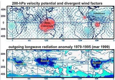
This is depicted here. In the upper panel is the divergence and convergence represented by the arrows. This is simply clipped from one of the monthly climate reviews that is published by the national weather service, and used as a slide, because it clearly shows the region which is dominated by this violent upward motion, colored in red here.
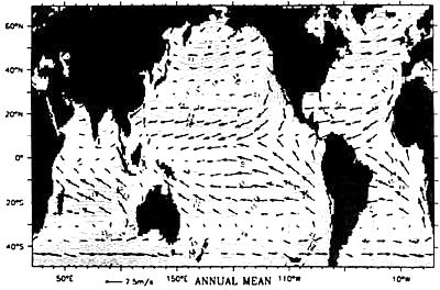
We see the Amazon Basin over South America and the western Pacific region which we'll refer to as the warm pool and it takes the whole rest of the planet to accommodate the subsidence. This is rather clearly depicted by the map which is using actual observations from wind profiles that are now taken in both hemispheres over the rest of the planet, and rather well represented.
The bottom panel is showing outgoing longwave radiation and you can translate this into rainfall because the deep convection is greatly influential in determining the amount of outgoing radiation: the higher, the colder. So by measuring the outgoing LW radiation, you are essentially mapping the deep-convective powers. You see the three regions that we talked about. |
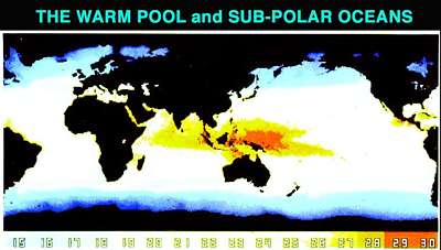
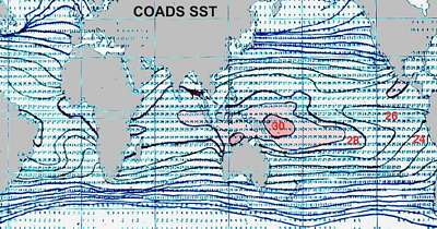
This is a NASA photograph of the NASA satellite sensing ocean surface temperature (SST), and here the Warm Pool which we call the region above 29 degrees centigrade. It turns out that the surface temperature is very influential in determining whether deep convection takes place because there are a lot of inhibiting factors, chief of which is vertical wind shear, and you need a certain amount of buoyancy to overcome the inhibiting factors, which is closely related to the surface temperature of the ocean. Perhaps a better index would be the difference between the surface and the upper troposphere but we have not been observing the upper troposphere to go back very far. This can be done in the future for a more detailed monitoring, but we can go back in time with ocean surface temperatures. |
We need to look at the size of the Warm Pool because it is the size of the Pool that is above this critical temperature, is important as the process also needs room to take place. So instead of looking at the mean temperature of the tropical ocean, it is really the size of this area which forms the critical factor in forcing the changes in atmospheric circulation. The size varies with time and the location varies with time, especially with the ENSO process that we've just been through. In an El Niño episode there is a tendency for it to be enlarged and to move eastward. Not only intensity but also its location changes with time.
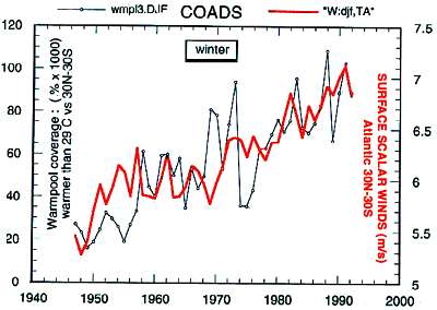 [Atlantic trade winds] So when we look at these various parameters, a striking thing that reflects these processes is to look at change over time of the size of the Warm Pool (black graph), defined here as the area which is warmer than 29 degrees centigrade, and we can compare it with the strength of the trade winds (red graph) 30 north to 30 South Atlantic and if we compare it (blue curve) with the global trade winds (red curve), [next graph] we see that the wind strength and the size of the warm pool change in unison over the last century, going back to 1930. [Atlantic trade winds] So when we look at these various parameters, a striking thing that reflects these processes is to look at change over time of the size of the Warm Pool (black graph), defined here as the area which is warmer than 29 degrees centigrade, and we can compare it with the strength of the trade winds (red graph) 30 north to 30 South Atlantic and if we compare it (blue curve) with the global trade winds (red curve), [next graph] we see that the wind strength and the size of the warm pool change in unison over the last century, going back to 1930. |
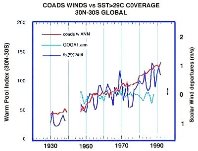 The cyan line is the output from the most expensive circulation model from the Geophysical Fluid Dynamics Laboratory in Princeton in a 40-year simulation using the observed sea surface temperature as the forcing factor and if it were a perfect model, its output should have changed like the other two curves. But instead it does not show any correlation over this 40 year period. So that remains today the principal defect in global circulation atmospheric models for representing long-term change and it obviously has something to do with the way you parameterize deep convection and also the modulation of the heat budget. But cloud and other factors are even beyond the computers we have today or even beyond the physics of how they are parameterized. The cyan line is the output from the most expensive circulation model from the Geophysical Fluid Dynamics Laboratory in Princeton in a 40-year simulation using the observed sea surface temperature as the forcing factor and if it were a perfect model, its output should have changed like the other two curves. But instead it does not show any correlation over this 40 year period. So that remains today the principal defect in global circulation atmospheric models for representing long-term change and it obviously has something to do with the way you parameterize deep convection and also the modulation of the heat budget. But cloud and other factors are even beyond the computers we have today or even beyond the physics of how they are parameterized. |
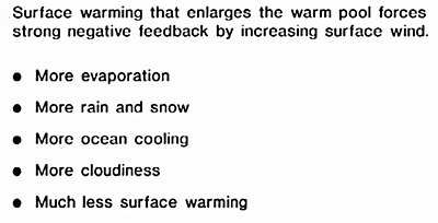 Surface warming enlarges the Warm Pool then draws large negative feedback by surface winds causing more evaporation; more rain and snow; more ocean cooling; more cloudiness; much less surface warming because the heat of evaporation is extracting heat from the oceans. It causes more atmospheric warming because that heat is released by condensation in the mid-troposphere. Surface warming enlarges the Warm Pool then draws large negative feedback by surface winds causing more evaporation; more rain and snow; more ocean cooling; more cloudiness; much less surface warming because the heat of evaporation is extracting heat from the oceans. It causes more atmospheric warming because that heat is released by condensation in the mid-troposphere. |
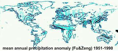 If we look at historical records of rainfall change, and ask the question where are changes in rainfall greatest? We see what might be expected, along the intertropical convergence zone from Mongolia towards the southwest, dipping down over India and across Africa. We see the northernmost limit of the ITC (across Beijing) and the southernmost limit of the ITC across northern Australia. And that emphasizes the range of variability in the annual cycle in this important process associated with the monsoon. If we look at historical records of rainfall change, and ask the question where are changes in rainfall greatest? We see what might be expected, along the intertropical convergence zone from Mongolia towards the southwest, dipping down over India and across Africa. We see the northernmost limit of the ITC (across Beijing) and the southernmost limit of the ITC across northern Australia. And that emphasizes the range of variability in the annual cycle in this important process associated with the monsoon. |
 GIF animation of the size of the Tropical Warm Pool by decade 1900-1984. What forces the changes in the warm pool? This movie shows by decade the changes we observed. Decade by decade it has been increasing steadily since the beginning of last century. GIF animation of the size of the Tropical Warm Pool by decade 1900-1984. What forces the changes in the warm pool? This movie shows by decade the changes we observed. Decade by decade it has been increasing steadily since the beginning of last century. |
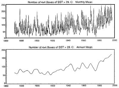
 This is a closer look at the index of the Warm Pool, by simply counting the number of squares 4x4 degrees, that are warmer than 29 degrees centigrade. It is a large enough area so you can get a rather good representation over almost the whole century and that is what is plotted here. You see that what looks like noise, isn't really noise but we see a great deal of variability, most of which is associated with the occurrence of the ENSO (El Niño Southern Oscillation) and anti-ENSO which is now called La Niña events. If you look at the righthand side, it is particularly interesting. The last strong ENSO event was 1997 and before that the strongest was 1982. Those were the two strongest in the recent century. This is a closer look at the index of the Warm Pool, by simply counting the number of squares 4x4 degrees, that are warmer than 29 degrees centigrade. It is a large enough area so you can get a rather good representation over almost the whole century and that is what is plotted here. You see that what looks like noise, isn't really noise but we see a great deal of variability, most of which is associated with the occurrence of the ENSO (El Niño Southern Oscillation) and anti-ENSO which is now called La Niña events. If you look at the righthand side, it is particularly interesting. The last strong ENSO event was 1997 and before that the strongest was 1982. Those were the two strongest in the recent century. |
After each of those you had a short period of rather strong La Niña conditions, which is a cooling in the tropical region, influencing the size of the Warm Pool rather dramatically. Those two big dips represent those two periods, but if you look closely over the whole record, you'll see that this phenomenon is occurring after each ENSO. And you also find that it is a very sensitive index. If you look at the extreme righthand side, that minimum close to the end, occurred only a couple of months ago as this slide is uptodate to May of this year (2000). Along with this represents dryness over the whole planet, in a way as shown in the last few slides. We see it manifested here by wide-spread forest fires which are raging in California and next-door, but also all over the world in various similar places.
| This [Atlantic Ocean wind field departures above] is the wind field updated to May of this year. I would call attention to the extreme righthand side. The second graph from the top represent the North Atlantic westerlies; the bottom one representing southern hemisphere westerlies. One can see a very dramatic change over the last couple of years; a weakening of the wind system, co-inciding with the Warm Pool index as the two are dramatically related. |
The complexity has been described by many people including such great scientists as Einstein, Von Neumann, pointing out that the ocean drives the atmosphere, that the atmosphere drives the ocean and that the interactions occur on all time and space scales, with nonlinearities and thresholds and that the representation of all these interactions, are almost beyond comprehension. The simplicity is that nature knows all the rules, and knows all the boundary conditions and knows where the mountain ranges are and the rest of the geography, and nature's answer to that question is this average picture. When you think of it in a holistic sense, you can think, if whatever is forcing this system, if it changes in magnitude, you can expect that the whole pattern will wax and wane in unison. And that is exactly what the observed record is showing as here with the wind field. As the forcing increases, the highs become higher, the lows lower and visa versa.. |
When we look at things which are reported to be representative of global warming, the first thing to do is to put it in this context, and say: do all the parameters agree? When an idea becomes popular, all sort of things are attributed to it.
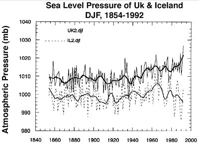 This is an example of the observed pressure field over England and Iceland and that pressure gradient between Kew observatory and Reykjavik has been observed for quite a long time and is depicted here, but you see, over the last 30 years since 1970, these two lines are dramatically diverging, so the difference in pressure is greatly augmented. If we pick similar places over the whole planet while looking at various parameters, we see the same thing. This is an example of the observed pressure field over England and Iceland and that pressure gradient between Kew observatory and Reykjavik has been observed for quite a long time and is depicted here, but you see, over the last 30 years since 1970, these two lines are dramatically diverging, so the difference in pressure is greatly augmented. If we pick similar places over the whole planet while looking at various parameters, we see the same thing. |
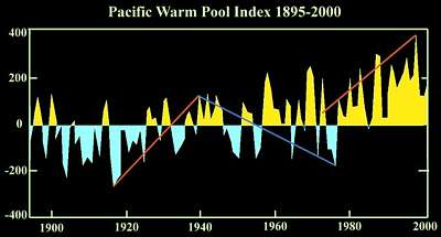
 Looking at the size of the Warm Pool, it shows the same thing, plotted over last century in the upper panel here, and smoothed somewhat for clarity in the lower panel. I call attention to the last 30 years since about 1970, we see a dramatic increase which is unprecedented in this century for total magnitude and duration, but we see the same kind of warming increase during the 1920s. It didn't last as long but about half the warming of the last century, which you frequently hear quoted associated with greenhouse warming, occurred in the 1920s. And the next 40 years to about 1973 was in fact a cooling trend, even though carbondioxide continued to increase exponentially during this period. Looking at the size of the Warm Pool, it shows the same thing, plotted over last century in the upper panel here, and smoothed somewhat for clarity in the lower panel. I call attention to the last 30 years since about 1970, we see a dramatic increase which is unprecedented in this century for total magnitude and duration, but we see the same kind of warming increase during the 1920s. It didn't last as long but about half the warming of the last century, which you frequently hear quoted associated with greenhouse warming, occurred in the 1920s. And the next 40 years to about 1973 was in fact a cooling trend, even though carbondioxide continued to increase exponentially during this period. |
In fact, in the 1960s a group of concerned scientists were writing letters to the President warning of the possibility of a coming ice age. The Government was asked to examine this problem and advise the White House how to respond to this. It turned out that this was just before the trend changed. The trend of rapid warming from 1970 on and during the 1920s is not unprecedented, since an almost identical trend occurred from 1800-1830.
First I would like to state an hypothesis: nature will continue to behave as it has in the past. If we had made this hypothesis at any time in the past 400,000 years, it would have been correct, so that gives us some reasons to believe that it may be correct today, and will express the same rhythms.To validate this, we need long records, discover the rhythms and project these into the future.
On a century time scale the dominant rhythm we see has a periodicity of about 170-180 years in which the accumulation of snow and temperature as in the oxygen-18 isotope, are in unison in all records from ice cores. When we look at the detail of the wind field over the last 150 years, we see that the system is absolutely dominated by the strength of the wind. But a 146 years of data is not enough to define a 170 year cycle. |
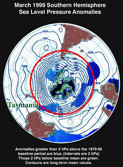
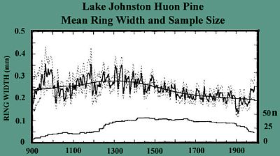 Looking at it in closer detail, we can turn from ice cores to tree rings, and this is a record from Tasmania which is sampling the SH westerlies, the most energetic feature of the global system over more than a thousand years. This was done by Lamont Doherty Geological Observatory in Columbia. This slide shows the raw data, but when analyzed for periodicities, it turns out that it has two dominant periodicities. Looking at it in closer detail, we can turn from ice cores to tree rings, and this is a record from Tasmania which is sampling the SH westerlies, the most energetic feature of the global system over more than a thousand years. This was done by Lamont Doherty Geological Observatory in Columbia. This slide shows the raw data, but when analyzed for periodicities, it turns out that it has two dominant periodicities.
|
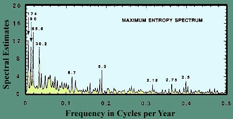
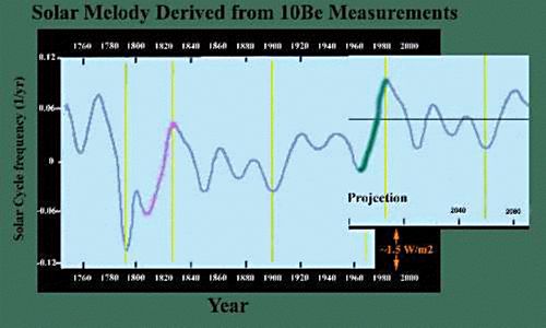
This graph is a periodicity analysis with a main 174-year cycle [leftmost peak] done by one statistical method and using the entropy method they came up with 180, which is the same thing. We see that this is a very prominent cycle which encourages us to interpret the detailed observations in this context. |
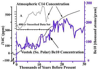
Now I like to talk about indices of solar forcing. Traditionally for some time now, there has been widespread use of carbon-14 as an index of solar activity or solar intensity received. The trouble with carbon-14 is that carbon is such an active substance biochemically, that it is exchanged back and forth in our environment as it is sequestered in vegetation, and all these things have to be taken into account. Now there is a new tracer increasingly being used, in the form of Beryllium-10 which has a longer half-life than C-14 and it is not so chemically active. This is a comparison between C-14 and Be-10 over the last 30,000 years. They compare rather well in the most recent time but there is some divergence (20-30,000 years ago) which presumably is due to C-14's active nature. |
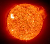 Using Be-10 gives us a look at solar irradiance in more detail. The sun is of course a very active region, a small ball of presumably liquid in the centre and an enormous cloud of plasma and gases around it and a convective zone which extends most of the way, transporting heat from the inside to the outer part where it is radiated. That radiation we see as sunlight, affecting the Earth, and now we would like to learn something more about how much does it vary and what effect does that variability have on the climate system. Using Be-10 gives us a look at solar irradiance in more detail. The sun is of course a very active region, a small ball of presumably liquid in the centre and an enormous cloud of plasma and gases around it and a convective zone which extends most of the way, transporting heat from the inside to the outer part where it is radiated. That radiation we see as sunlight, affecting the Earth, and now we would like to learn something more about how much does it vary and what effect does that variability have on the climate system. |
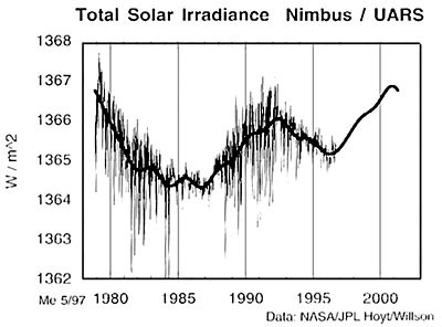 Solar irradiance has been measured outside the atmosphere only for 20 years now since 1979. This is 20 years later than it could have been measured, and the reason for this was that everybody was so sure that the solar constant was constant, that it had no priority. It is now being measured quite reliably by NASA who sent out several satellites so that their data records overlap. This slide is 10 years old. During this satellite period we've been able to compare Beryllium with actual solar irradiation, and now it is generally accepted as a substitute for C-14. Solar irradiance has been measured outside the atmosphere only for 20 years now since 1979. This is 20 years later than it could have been measured, and the reason for this was that everybody was so sure that the solar constant was constant, that it had no priority. It is now being measured quite reliably by NASA who sent out several satellites so that their data records overlap. This slide is 10 years old. During this satellite period we've been able to compare Beryllium with actual solar irradiation, and now it is generally accepted as a substitute for C-14. |
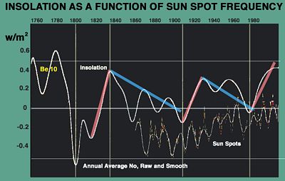
Beryllium has been measured in ice cores going back to 1600, a long enough time scale to determine its periodicities in the white line shown here. Below the curve is the geomagnetic index observed at the Kew Observatory, over the same period. There is a relationship between the two but we do not understand what it is. |
This is the same curve and if we follow our hypothesis that nature repeats itself, we can duplicate the last 170 years onto the end (today) where the curve ends.
|
 The blue and purple is the solar irradiance as represented by Be-10 and on the righthand side extended by 170 years to fit the pattern that I have just described. The yellow curve is the NH temperature anomaly. At the bottom the size of the warm pool and the recent warming is exactly reflected in the size of the warm pool. At the top is a sample of the wind field since 1854, duplicated to the right with a gap to allow for 170 years. The blue and purple is the solar irradiance as represented by Be-10 and on the righthand side extended by 170 years to fit the pattern that I have just described. The yellow curve is the NH temperature anomaly. At the bottom the size of the warm pool and the recent warming is exactly reflected in the size of the warm pool. At the top is a sample of the wind field since 1854, duplicated to the right with a gap to allow for 170 years. |
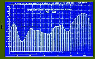 Of course everyone wants to speculate about the future, and our colleagues of the Free University of Berlin (Werner Mende [1]) did that kind of a prediction over two years ago in which they took into account the estimated greenhouse warming and the projection along the same lines, not depending on the 170 year cycle but from the Beryllium record. They identified the Gleissberg Cycle of solar activity, which is of the order of 80-88 years and has a 208 year cycle as the dominant cycle. Based upon this they made the projection of how this would evolve into the future if it followed the pattern of the past. Combining that with the estimated greenhouse warming, they come up with this, which is very heavily smoothed with a 23-year smoother representing the double sunspot cycle. They have it [temperature] peaking in the 2020s. Of course everyone wants to speculate about the future, and our colleagues of the Free University of Berlin (Werner Mende [1]) did that kind of a prediction over two years ago in which they took into account the estimated greenhouse warming and the projection along the same lines, not depending on the 170 year cycle but from the Beryllium record. They identified the Gleissberg Cycle of solar activity, which is of the order of 80-88 years and has a 208 year cycle as the dominant cycle. Based upon this they made the projection of how this would evolve into the future if it followed the pattern of the past. Combining that with the estimated greenhouse warming, they come up with this, which is very heavily smoothed with a 23-year smoother representing the double sunspot cycle. They have it [temperature] peaking in the 2020s. |
[1] Gerhard Wagner et al. (2001):Presence of the solar De Vries Cycle (~205 years) during the last ice age. Geophys Res Letters 28, 303-306
Sea Level
 We are hearing a good deal about rising sea levels these days. It is based on some of the islands like the Seychelles and islands in the western Pacific but by the time it reaches the New York Times, the rise in sea level could swamp Manhattan. So I want to put this in context by calling attention to the way sea level behaves. We have referred to Antarctica as the strongest heat sink on the planet and being responsible for the SH westerlies, by far the strongest wind system. The wind exerts stress on the surface of the ocean and is the principal mover of the ocean. If you examine how this movement takes place, an oceanographer named Ekman (a Swede) derived a set of computations for doing this and this says that in the SH there is a deflection to the left and in the NH to the right. So a circumpolar wind field around Antarctica will deflect the ocean towards the equator. The question then becomes by how much in extent and magnitude. We are hearing a good deal about rising sea levels these days. It is based on some of the islands like the Seychelles and islands in the western Pacific but by the time it reaches the New York Times, the rise in sea level could swamp Manhattan. So I want to put this in context by calling attention to the way sea level behaves. We have referred to Antarctica as the strongest heat sink on the planet and being responsible for the SH westerlies, by far the strongest wind system. The wind exerts stress on the surface of the ocean and is the principal mover of the ocean. If you examine how this movement takes place, an oceanographer named Ekman (a Swede) derived a set of computations for doing this and this says that in the SH there is a deflection to the left and in the NH to the right. So a circumpolar wind field around Antarctica will deflect the ocean towards the equator. The question then becomes by how much in extent and magnitude.
|
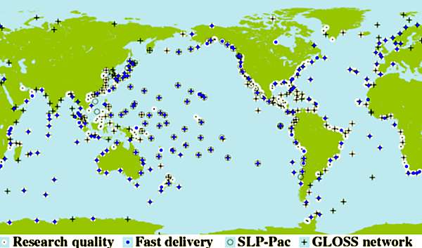
We do have a global sea level network, depicted here. The colored spots with some black in it are the ones that are active. In addition there are some that have never been activated, represented by crosses, and there are about 8-10 around Antarctica, several here in the South Pacific. It is often mentioned that 90% of sea level gauges around the world have reported an actual rise in sea level, which is true but the reason is that they are not sampling the dominating signal which I now will show you. |
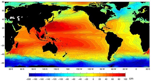 [Topex Poseidon mean sea surface topography] It is associated with that circumpolar vortex around Antarctica. NASA on the other hand manages the Poseidon system of satellites, which measures sea level with a laser which is very accurate and very detailed, but it is a relative measurement. It is not like the micromeasurements with sea level gauges. The image shows that the fall in sea level around Antarctica is around 130cm. If you look at the sea level network you see that most gauges are located in the places with high sea levels.
 |
The area around Antarctica is about half of the planet and it has to be balanced by the rest of the oceans. An increasing wind stress over all oceans, which has been occurring over the last decades, lowers the subantarctic oceans while lifting the other oceans, increasing sea levels in the western Pacific while decreasing in the eastern Pacific. If you look at the tide gauge in San Francisco, Los Angeles and Seattle, you'll see that they show a steady decrease that is in phase with the wind field, and on the opposite side of the Pacific, they show the opposite. So the message is that it is wind stress we must look at in judging the small changes in sea level.
Conclusion, morphology of climate change
- What changes: wind strength is a robust feature of climate change, affecting evaporation, precipitation, cloudiness, sea surface temperature and air temperature.
- Variability of wind strength is 34% on century time scales. It is caused by the variability of Deep Tropical Convection which directly forces the Hadley circulation.
- Deep Tropical Convection is related to the area of ocean warmer than 29ºC (Warm Pool). These features are well monitored.
- Variable size of Warm Pool is mainly forced by variable solar irradiance (0.5-1.6% in a century or 7-13 W/m2).
- A good proxy for irradiance is 10Be, which can be measured in ice cores to validate past variability.
- The variability of irradiance is dominated by two periodicities, 88 years and 208 years, of about equal amplitude.
- By validating the past irradiance record, future climate can be estimated as a rapid rising trend from 1976 to 2003, followed by a rapid decrease. (following our method with a 170 year cycle)
The relationship between wind speed and evaporation and irradiance is indeed very important. In the coming years, solar irradiation will decrease, thereby compensating for any warming from the enhanced greenhouse effect.
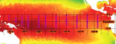 In the Pacific Ocean we have 65 moored buoys which were placed there in order to monitor the ENSO phenomenon, from South America to Papua New Guinea [TAO TRITON moored buoys]. That is a much denser network than I would ask for in order to monitor that process. In late 1997 NASA established the TRMM Tropical Rainfall Measurement Mission, measuring a whole lot of parameters with an active radar to measure presence and rate of rainfall. I hope that TRMM will be continued indefinitely because it is crucial to understanding climate. In the Pacific Ocean we have 65 moored buoys which were placed there in order to monitor the ENSO phenomenon, from South America to Papua New Guinea [TAO TRITON moored buoys]. That is a much denser network than I would ask for in order to monitor that process. In late 1997 NASA established the TRMM Tropical Rainfall Measurement Mission, measuring a whole lot of parameters with an active radar to measure presence and rate of rainfall. I hope that TRMM will be continued indefinitely because it is crucial to understanding climate. |
As time goes on, there are of course longer cycles than the ones we've been talking about, but records do not go back far enough to examine them. There is for instance a 2400 year cycle, and so. We can be encouraged that through the use of Beryllium-10, much longer cycles can be examined.
Meanwhile this has spurred a number of studies on the effect on the economy and society in general from warming, and there has just been published from Oxford University Press a rather large compendium by a number of panels of experts looking at this question. The bottom line is that they say that warming is beneficial. Warming of up to 2.5 degrees globally would be beneficial with 2.5 the optimum. Warming beyond that could be detrimental up to about 5 degrees, and very detrimental after that. What that tells us is that we have room to maneuver as we are not going to see any significant warming in the coming century. And for 88 years the projected cooling will be compensating the projected greenhouse warming, enough time to study the processes and to adapt.

Obituary
(By Gary Duane Sharp)
Joseph Otis Fletcher
Died July 6, 2008 in Sequim, WA
Age 88 years
___________________________
 JOSEPH FLETCHER was born outside of Ryegate, Montana, on May 16, 1920 the son of Clarence Bert Fletcher and Margaret Mary Mathers.
Joseph also lived in Port Angeles, WA and California but was primarily raised in Oklahoma. He received a B.S. in GeoPhysics from University of Oklahoma. He then earned a certificate in Meteorology from M.I.T. originally entering the Army in 1941 into a horse drawn artillery unit transferring to the Army Air Corps later in 1941. After being trained as a fighter pilot he was assigned to a Search Attack squadron at Langley Field, VA flying B-18s. He was transferred to the M.I.T. Propagation Research Group where he developed meteorological instrumentation for use on aircraft and developed the use of microwave radar for direct observation of meteorological processes. Later he was detailed to fly B-29 reconnaissance missions out of Guam over Japan. After WWII he finished his graduate work receiving a Masters in Physics from UCLA. He was married to Caroline Sisco Howard on October 15th, 1949.
Later he commanded the 58th Strategic Reconnaissance Squadron at Eilson near Fairbanks, AK. It was during this time that he led the first expedition landing a plane at the North Pole in 1952, arguably the first expedition to actually reach the pole. He subsequently established a permanent manned weather station on T-3 known as Fletcher’s Ice Island, a floating platform conducting scientific research in the Arctic for 30 years. He was awarded the Legion of Merit for Exceptionally Meritorious Conduct and Outstanding Service. He then was involved with the development of the DEW line in the Arctic region before being reassigned to the Air War College and then on to the Navy War College as a lecturer primarily on Air Operations in the Arctic. In 1957 he was transferred to Norway as Chief of the Air Mission to the Norwegian Air Force. The tour in Norway was an influential time on his young family. He retired from the Air Force in 1963.
He went on to become a world leader in climate research and received a doctorate from University of Alaska in 1979. He held positions such as Research Scientist at RAND Corp., Research Professor and Director of polar research programs at the University of Washington, Director of Polar Programs for the National Science Foundation, Assistant Administrator for NOAA’s Ocean and Atmospheric Research, and retiring in 1993 as Director NOAA’s Environmental Research Laboratories. Some accomplishments include the establishment of the National Science Foundation’s Office for Climate Dynamics, and leading the development of the International Comprehensive Ocean-Atmosphere Data Set (ICOADS) that provides most of the recent climate research community with their basis in historical observations. He was a leader in the understanding of the world’s Ocean and Atmospheric Dynamics. In 1993 he received the Lomosonov Medal awarded by the Russian Academy of Sciences. His polar activities are commemorated in the naming of geophysical features such as Fletcher Abyssal Plain in the Arctic and Fletcher Ice Rise in the Antarctic.
Joseph is survived by five children, Margaret Sieger of Boulder CO, Christina Quilter of Anchorage AK, Joseph Fletcher of Homer AK, Richard Fletcher of Sequim WA, and Jonathon Fletcher of St. Louis MO, ten grandchildren, and one great grandchild.
A memorial service were held on Thursday July 10, 2008 at the Drennan-Ford Funeral Home in Port Angeles, WA.
Fletcher links
Joseph Fletcher: Do people make deserts? http://www.bu.edu/remotesensing/files/pdf/372.pdf
Joseph Fletcher: Ice islands from the Ellersmere breakoff: Was Cook's Bradley land a sighting? https://kb.osu.edu/dspace/bitstream/handle/1811/44488/BPRC_Report_18_Part2.pdf?sequence=2
Science: Arctic Outpost, Mar. 31, 1952: http://www.time.com/time/magazine/article/0,9171,935593,00.html
Woods Hole Oceanic Institute summary: http://www.whoi.edu/page.do?pid=66623
A Study of Mail from Ice Islands; featuring T-3 Fletcher's Ice Island, Drift Station Bravo, http://www.qsl.net/kg0yh/ice.htm
Firebirds Support Fletcher’s Ice Island: http://www.firebirds.org/menu2/t3/t3_p01.htm
Charles Compton: First Aircraft Landing at North Pole http://www.arcticwebsite.com/BenedictNPole.html
The first verified placing of the US flag at the North Pole happened on May 3rd, 1952, when U.S. Air Force Lieutenant Colonel Joseph O. Fletcher and Lieutenant William P. Benedict, along with scientist Albert P. Crary, landed a modified C- 47 Skytrain at the North Pole.
Fletcher lands on the North Pole, 3 May 1952 : http://www.history.com/this-day-in-history/fletcher-lands-on-the-north-pole
J O Fletcher notes http://www.enotes.com/topic/Joseph_O._Fletcher
C R Clayton: History of the 58th Strategic Weather Reconnaisance Squadron, http://sites.google.com/site/58thwrs/history
Fu, Congbin, Henry F. Diaz, Dongfeng Dong,. Joseph O. Fletcher (1999): Changes in atmospheric circulation over northern hemisphere oceans associated with the rapid warming of the 1920s. link.
Fu, Congbin, Joseph O. Fletcher, 1985: The Relationship between Tibet-Tropical Ocean Thermal Contrast and Interannual Variability of Indian Monsoon Rainfall. Journal of Applied Meteorology: Vol. 24, No. 8, pp. 841–848.